UX case study for NumiNica - Numismatic online portfolio
How NumiNica’s experience was shaped for collectors, researchers, and institutions—without turning heritage into generic e-commerce noise.
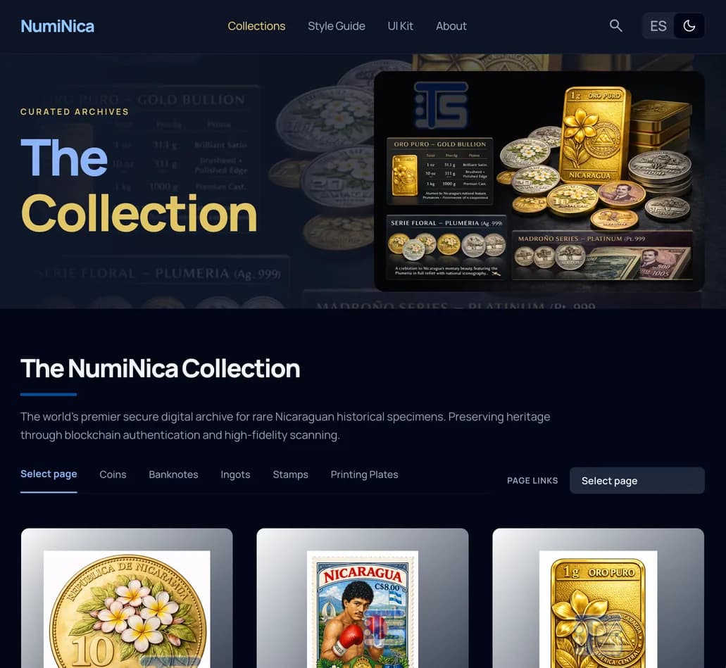
Context
NumiNica curates Nicaraguan numismatic heritage: coins and banknotes that deserve the same care as physical archives. The product isn’t just “browse and buy”—it’s provenance, certification language, and high-fidelity imagery working together so the story of each specimen stays credible across generations.
Problem
Standard marketplace patterns optimize for density and speed. For rare pieces, that creates the wrong feeling: cluttered grids, noisy borders, and typography that reads like retail instead of research. Users need calm scanning, legible metadata, and a visual tone that signals trust—not urgency or gimmicks.
Users & goals
Primary audiences include serious collectors comparing die varieties, researchers tracing issuance history, and institutions presenting collections with institutional-grade clarity. Success looks like: quick orientation in the catalog, confident reading of grades and notes, and photography that feels like a museum pedestal, not a thumbnail strip.
Approach
We anchored the interface to a single creative north star—“The NumiNica Collection”—treating every specimen as museum-grade. Layout favors editorial rhythm: intentional asymmetry, generous whitespace, and layered surfaces so hierarchy comes from tone and depth, not from boxing content in 1px rules. Manrope carries the full typographic system so labels, body copy, and headings feel like one precise instrument—aligned with how certification and grading are communicated in the real world.
Key UX decisions
Surface hierarchy replaces arbitrary dividers: background shifts and subtle lifts distinguish sections and cards. Primary actions use a signature blue gradient for metallic depth; floating navigation leans on glass-style surfaces so context bleeds through instead of chopping the page. Form fields use tonal fills and a bottom-edge focus accent to keep inputs architectural and calm. Throughout, emphasis is carried by weight and color—not italics—so the voice stays objective and authoritative.
Outcome
The result is a system where the UI steps back and the artifacts step forward—consistent with NumiNica’s mission to preserve authentic, accessible heritage. This style guide documents the tokens and patterns so light and dark themes, components, and typography stay aligned as the collection grows.
Tools & imagery
The design was created with Stitch by Google, an AI-assisted UX design tool. All images used on the site are custom generative AI.